Web app · SberBank / SberTech
Graph data visualisation service
Group project, all design deliverables by me · Used Figma, Photoshop & Illustrator


01.Overview
Company
Sber is the largest bank and financial technology company in Russia. It offers a wide range of banking, investment, insurance, and digital services, including ecosystem products in healthcare, education, e-commerce, and cloud technologies.
Project
BigRaph (Crystal View) is a web interface for the Montecristo platform within Sber’s ecosystem. It visualizes large datasets as graphs, helping users analyze connections between individuals, companies, holdings, and government contractors. This simplifies investigations, credit risk assessments, and fraud detection.


Graph visualization UI before the redesign and the Graph platform rebranding
My role
- Creating feature concepts for the product
- Conducting UX research
- Developing UI
- Designing branding
- Writing technical documentation
- Leading release acceptance testing
02.Redesign drivers
Situation
Since joining the team, I maintained the existing platform interface, adapting it to new features and ensuring its stability. However, over time, it became clear that accumulated issues were preventing users from effectively completing their tasks. I compiled a list of the main problems at that time:
- Lack of visual identityThe old name caused confusion, and the Graph Platform lacked a clear brand identity. It was necessary to redefine the branding, unify the interface style, and enhance the visual structure.
- Performance and data visualization optimizationLarge graphs loaded slowly, and interactions were inefficient. Improvements were needed in rendering speed, data positioning, and scalability.
- Outdated interface and competitive pressureThe design did not meet modern standards, negatively impacting the perception of the product. Competitors (Neo4J, Spark Interfax) offered more user-friendly solutions, necessitating a UI and UX overhaul to maintain competitiveness.
- Poor usability
and complex UXUsers and business stakeholders reported difficulties with navigation and task execution. New business requirements further complicated interactions, making the system even less intuitive.
Objectives
Based on these key points, through brainstorming sessions, the team and I identified the following goals:
- Analyze the interface UX and pinpoint key issues that hinder user workflows.
- Conduct a phased redesign, incorporating UX research findings before and usability testing results between iterations.
- Establish a unified visual identity for the entire Graph Platform and its products.
- Optimize graph computation logic and transition to a new rendering technology in the browser (which, of course, was handled by the front-end developers).
Briefly about the rebranding
Looking ahead, I conducted a full rebranding of the Graph platform and might cover it in another case study. But briefly, here’s what was achieved:

03.Research
Latin dance classes In manhattan
Methods
I first started by studying user needs and pain points. To achieve this, we established a direct feedback channel – integrating a feedback feature into the interface and highlighting its introduction in a system-wide newsletter.
Later, we launched a large-scale survey among active users to gain deeper insights into their challenges. Around 80 analysts participated, answering questions about navigation usability, system performance, feature clarity, and desired improvements.
Additionally, we conducted three interviews with business stakeholders responsible for integrating the platform into their processes. These interviews focused on key efficiency metrics for their analysts and the interface issues that slowed down their workflow.
Nuance
Data collection was challenging due to the inability to integrate third-party analytics services such as Yandex Metrica and Google Analytics, as the platform operates within an internal network without internet access.
Key research findings
As a result of the above research activities, we gathered the following insights:
- 68% of users struggled with navigation in the main menu and had difficulty finding key functions.
- 72% of users were unaware of newly introduced features or only discovered them after some time.
- 45% of users found the graph search functionality inconvenient.
- 45% of users mistakenly believed that the name Bigraph referred to the entire Graph Platform (which was already known).
- Business stakeholders aimed to reduce the average investigation time for their analysts, which at that point was 30 minutes per case.
- A majority of users, both in surveys and through direct feedback, complained about long loading times (over 2 minutes) and performance issues when working with graphs larger than 500 nodes (though this issue was already well-known).
- Additionally, some respondents mentioned that they did not understand how to use the system properly.

The old interface with outdated design and complex navigation, making it difficult to perform key operations
04.Design process
Iterative design rollout
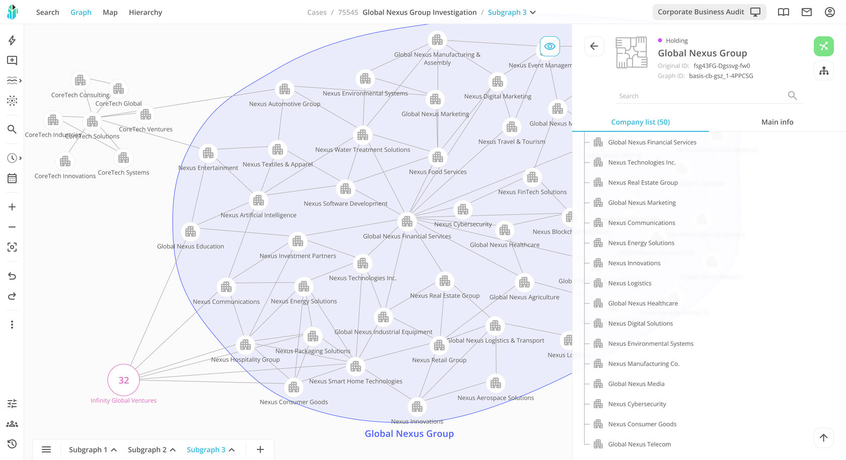
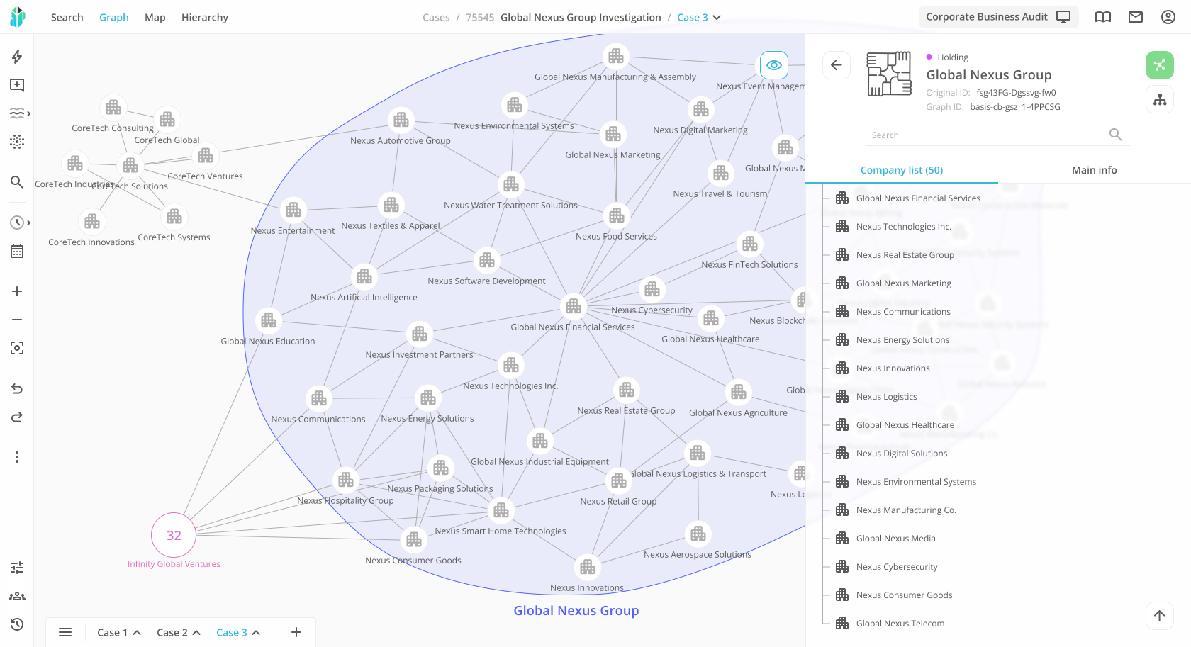
The design process involved creating a single main prototype, followed by a gradual, phased implementation of the new design. Instead of rolling out the entire redesign at once, updates were introduced iteratively, allowing users to adapt smoothly while enabling us to test the changes. This approach ensured continuous feedback collection and iterative improvements at each stage of implementation.
Iterative design rollout illustrated by changes to the interface header, sidebar, and subgraph selection panel
Graph rendering logic
One of the key aspects of the redesign was improving the graph rendering process. In addition to creating the interface, I worked on the analytics and development of the graph visualization logic, which helped address several important challenges:
- Refined node visualization logic for handling nodes with a high number of surrounding connections.
- Redesigned manual and automatic node grouping system, which reduced visual clutter and improved readability.
- Reworked repulsion force logic to prevent incorrect node overlapping and enhance the clarity of graphs of any size.


Early stages of developing the new node grouping concept


Finalized concept of large node expansion logic and node repulsion logic for the technical specification
05.Final design


06.Redesign results
The redesign successfully removed barriers that had hindered users from working efficiently within the system. Improved navigation, optimized performance, and a clear visual identity made Crystal View more user-friendly, faster, and more intuitive for both analysts and business stakeholders.
1. Improved navigation and feature accessibility
• The percentage of users struggling with main menu navigation dropped from 68% to 20% after interface structure optimization.
• The time spent searching for key functions was reduced by 40% on average.
2. Increased user awareness
• The number of users discovering new system features with a delay decreased from 72% to 15%, thanks to notifications, regular newsletters, and updates on the login page.
• 85% of users are now informed about new features at the moment of release.
3. Optimized object search in graphs
• The percentage of users finding search inconvenient was reduced from 45% to 26% after improvements to search logic and better visual representation of results.
• The average time to find objects in a graph was reduced by 35%, partly due to the updated node rendering logic and a transition to a new rendering library.
4. Reduced investigation time
• The average investigation time, which was a critical concern for business stakeholders, was reduced from 30 minutes to the desired 15 minutes.
5. Graph performance optimization
• The loading time for graphs with 500+ nodes was reduced from over 2 minutes to an average of 1 minute.
• Complaints about lag and long load times dropped by more than 60%.
A few words on the new visual identity
The new branding and unified design style significantly improved the recognition of both individual products and the platform as a whole among users and new internal stakeholders.
07.Conclusion
Latin dance classes In manhattan
Key takeaways
The work on the Crystal View redesign demonstrated the importance of thorough user experience research and continuous feedback from end users. The phased rollout approach allowed for system improvements without abrupt changes, ensuring a smooth adaptation for users.
Impact on future projects
This experience strengthened my understanding of the importance of an iterative approach to interface development. In future projects, I began to place greater emphasis on gathering feedback, early prototype testing, and a gradual implementation process.


